How to use this social media design layout checker
Checking your social media design takes under a minute. Upload your image, select your platform and design type, and our free social media design layout checker instantly shows you exactly how your design will appear on both mobile and desktop — including safe zones and cropping areas.
1
Upload your cover photo, post design, or banner by dropping it or clicking to select.
2
Select your platform — Facebook, Instagram, LinkedIn, YouTube, X, TikTok, and more.
3
Choose Desktop, Mobile, or Both to see exactly how your design looks on each device.
4
Check the safe zone overlay to make sure no important content gets cropped on any device.
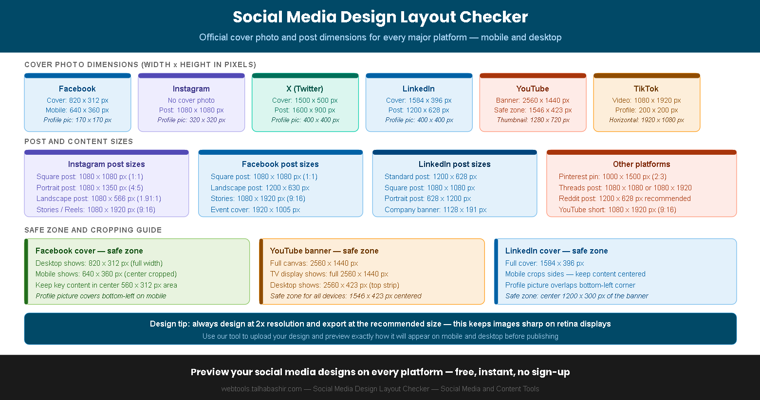
Complete social media image size guide for 2025
Using the wrong image dimensions is one of the most common mistakes in social media design. Each platform has specific requirements for cover photos, posts, stories, and thumbnails — and what looks perfect on desktop can be badly cropped on mobile. Our social media design layout checker shows you the exact crop for every platform and device combination.
| Platform | Content type | Recommended size | Aspect ratio | Safe zone |
|---|
| Facebook | Cover photo | 820 x 312 px | 2.63:1 | Center 560 x 312 px |
| Facebook | Post image | 1200 x 630 px | 1.91:1 | Full image visible |
| Instagram | Square post | 1080 x 1080 px | 1:1 | Full image visible |
| Instagram | Portrait post | 1080 x 1350 px | 4:5 | Full image visible |
| Instagram | Story / Reel | 1080 x 1920 px | 9:16 | Center 1080 x 1420 px |
| X (Twitter) | Cover photo | 1500 x 500 px | 3:1 | Center 1260 x 420 px |
| X (Twitter) | Post image | 1600 x 900 px | 16:9 | Full image visible |
| LinkedIn | Cover photo | 1584 x 396 px | 4:1 | Center 1200 x 300 px |
| LinkedIn | Post image | 1200 x 628 px | 1.91:1 | Full image visible |
| YouTube | Channel banner | 2560 x 1440 px | 16:9 | Center 1546 x 423 px |
| YouTube | Video thumbnail | 1280 x 720 px | 16:9 | Full image visible |
| TikTok | Video cover | 1080 x 1920 px | 9:16 | Center 1080 x 1420 px |
| Pinterest | Pin image | 1000 x 1500 px | 2:3 | Full image visible |
| Threads | Post image | 1080 x 1080 px | 1:1 | Full image visible |
Design tip — always create your designs at 2x the recommended resolution and export at the platform's recommended size. This keeps images sharp on retina and high-DPI displays across all devices.
The Facebook cover photo is the most commonly misdesigned asset — it shows differently on desktop (820 x 312 px) and mobile (640 x 360 px). Always check both views and keep critical content — your logo, text, or face — in the center safe zone.
Frequently asked questions about social media image sizes
Why does my Facebook cover photo look different on mobile?+
Facebook displays cover photos at different dimensions on desktop and mobile. On desktop, the cover photo shows at 820 x 312 pixels. On mobile, it crops to approximately 640 x 360 pixels — which means the left and right edges of your desktop cover are hidden on mobile, and more of the top and bottom is revealed. This is why you should always keep your most important content — your logo, text, or face — in the center safe zone of 560 x 312 pixels. Our social media design layout checker shows you both crops simultaneously so you can verify your design works on both devices before publishing.
What is a safe zone in social media design?+
A safe zone is the area of your design that is guaranteed to be visible on all devices and screen sizes. Content placed outside the safe zone may be cropped, hidden behind profile pictures, or cut off by interface elements depending on the device. For example, the YouTube channel banner has a safe zone of 1546 x 423 pixels centered within the full 2560 x 1440 pixel canvas — everything outside this zone is visible only on TV screens. Our layout checker shows the safe zone overlay on every applicable preview so you can see exactly which areas of your design are at risk of being cropped.
What is the best image size for Instagram posts in 2025?+
For Instagram posts in 2025, the recommended sizes are 1080 x 1080 pixels for square posts (1:1 ratio), 1080 x 1350 pixels for portrait posts (4:5 ratio), and 1080 x 566 pixels for landscape posts (1.91:1 ratio). The 4:5 portrait format takes up the most screen real estate in the feed and typically generates higher engagement than square or landscape formats. For Stories and Reels, the standard is 1080 x 1920 pixels (9:16 ratio). Always export at these exact dimensions rather than uploading a larger image and letting Instagram resize it automatically.
How do I design a YouTube channel banner that looks good on all devices?+
YouTube channel banners are the trickiest social media asset to design because they are displayed at completely different sizes across TV (full 2560 x 1440 px), desktop (2560 x 423 px strip), tablet, and mobile. The solution is to design on a 2560 x 1440 pixel canvas and keep all essential content — your channel name, tagline, and logo — within the center safe zone of 1546 x 423 pixels. Content outside this zone will be visible on some devices but hidden on others. Our layout checker shows you the desktop safe zone view so you can verify nothing critical falls outside it before uploading to YouTube.
Should I use the same image for all social media platforms?+
No — using the same image across all platforms is one of the most common social media design mistakes. Each platform has different aspect ratios, safe zones, and display sizes. An image that looks perfect as a Facebook cover will be badly cropped as a LinkedIn cover, and a square Instagram post will display with black bars or be cropped if repurposed for YouTube. The correct approach is to design a master image at high resolution and then export platform-specific crops for each network. Our social media design layout checker helps you check each crop before publishing so you can catch any issues in advance.
What file format should I upload social media images in?+
For most social media platforms, PNG is the best format for graphics, logos, and text-heavy designs because it uses lossless compression that preserves sharp edges and text clarity. JPG is better for photographs and complex images where file size is a concern. Most platforms now also accept WebP, which offers smaller file sizes than both JPG and PNG with excellent quality. Always check that your file size is under the platform's maximum — Facebook and Instagram accept up to 8 MB per image, while LinkedIn recommends keeping images under 5 MB for fastest loading times.
This social media design layout checker provides approximate previews based on publicly available platform specifications. Actual display may vary depending on device screen size, browser, app version, and platform interface updates. Always verify your design directly on each platform after publishing. Platform specifications are subject to change — check official platform help centers for the most current requirements.